The SHE Week 2026 branding keeps rolling, this time out into a full set of social templates and stickers that carry the campaign’s energy into every corner of the feed.
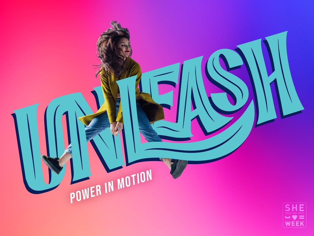
The system is built around bold, hand-lettered type and a bright, poppy gradient palette: hot pink fading into violet and blue, with pops of teal and mustard yellow. It’s a look made to move. Type warps and swoops across the frame, photography catches subjects mid-jump or mid-stride, and every asset feels like it’s in motion instead of posed for a photo.
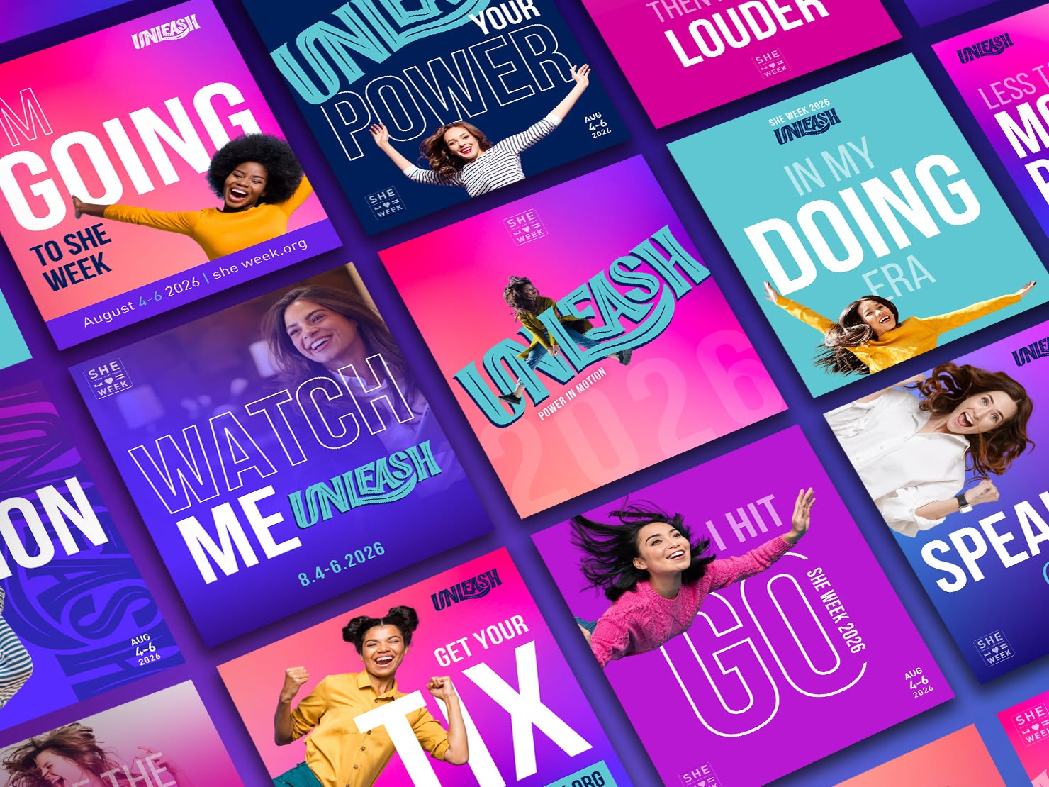
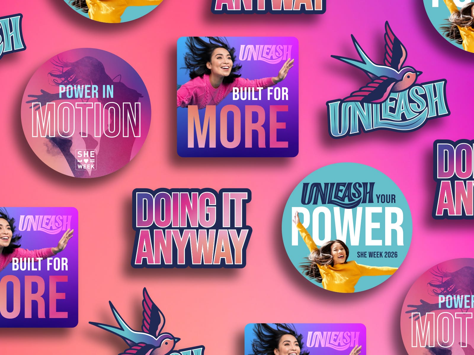
Tiles like “Power in Motion,” “Built for More,” “Doing It Anyway,” and “Unleash Your Power” mix and match across formats (square posts, stickers, story templates) so the campaign stays flexible without losing its identity. A hand-drawn swallow mark and the “SHE WEEK” wordmark tie everything back to the core brand no matter where an asset lands.
The result is a system that feels dynamic, expressive, and confident, which is exactly the energy SHE Week 2026 is built to deliver.