Meet the new GoldSpring Marketing brand.
GoldSpring is the DC-area marketing crew that restaurants, cafés, bakeries, and bars call when they need more people through the door. Grand openings, turnarounds, influencer campaigns: they’ve done it all, and they measure success in sales, not likes. A team like that needs a logo that pulls its weight.
Two letters, one move
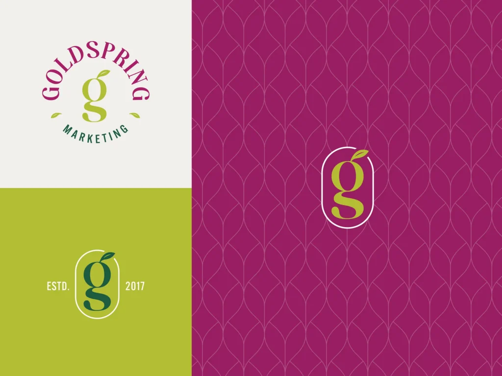
We drew a custom, modern “g” from scratch, then had an “s” form its lower loop. GoldSpring’s initials become one continuous shape that feels like it’s already moving. Fitting for a team whose whole job is building momentum.
A little something growing
A leaf sprouts right out of the letterform. It’s a nod to growth, fresh starts, and the “spring” in GoldSpring. It also works as a standalone icon, which is handy when you need a mark that fits in an Instagram avatar.
Bold, but friendly
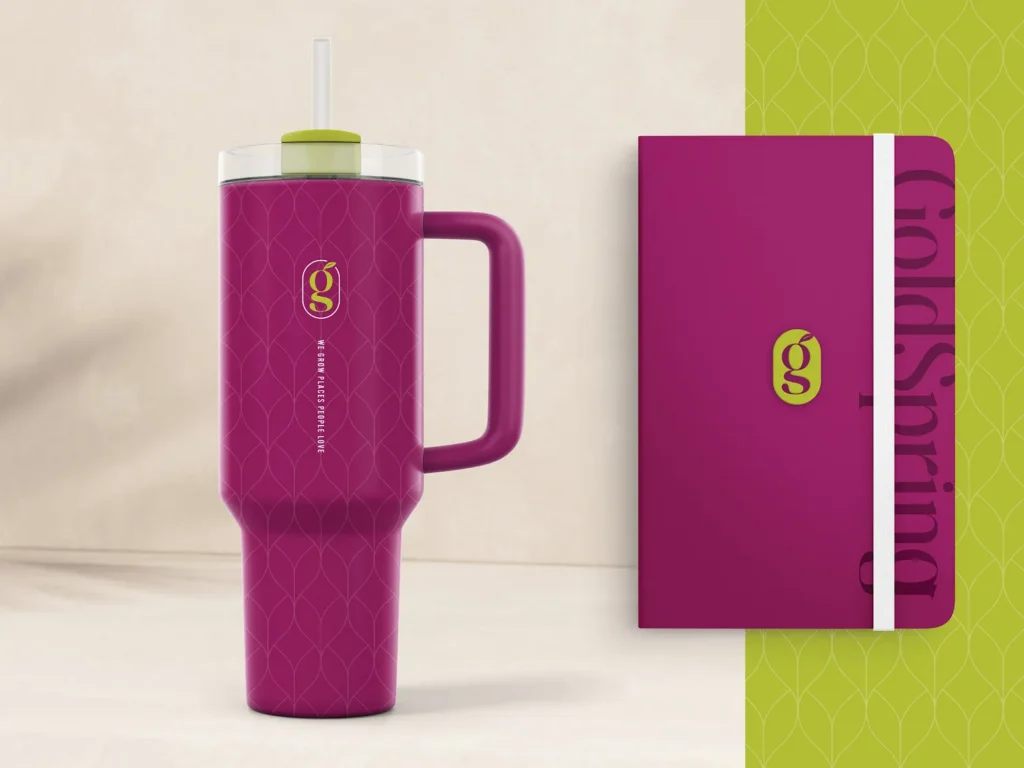
The mark is confident without being stiff, with a subtle feminine touch that gives it personality. It feels at home in the hospitality world (creative, warm, a little fun) while still looking sharp on a pitch deck or press kit.
The result? A brand that looks as good as GoldSpring’s results.