What do you get when you blend a hometown market with a new-school deli? The sister duo behind Pump + Rye in Urbana, Maryland have quite the handle on what it tastes like, and charged Octavo Designs with imagining what it looks like.
It All Began With a Logo and Brandmark
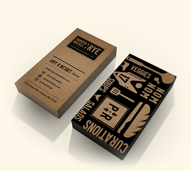
Designed to feel inviting and friendly but with a slight vintage nod in the typeface and muted brown rye grains. It’s perfectly paired with a custom pattern with graphic elements of the materials Pump + Rye utilize in their business to bring a modern twist to the old school deli aesthetic.
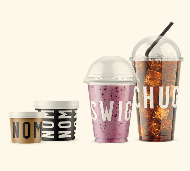
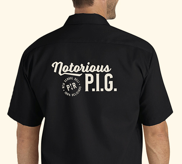
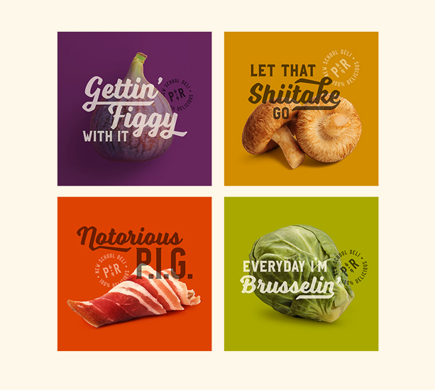
The new identity sizzles in the newly created business cards, as well as a new website to whet peoples’ appetites. But things really start cooking as we blend the new identity with the sisters’ sense of humor across various touchpoints. Carryout packaging is emblazoned with eating and drinking onomatopoeias; t-shirts are decorated with hilarious names of menu offerings … even the restroom signs have their own dose of chutzpah!
As FCOED worked with Octavo to create a brand, Octavo created an elevated image that our entire team immediately loved and weaved input from all of our stakeholders so we knew as we lead up to the unveiling, the brand would be well received. Thank you Octavo for becoming part of our “Team Frederick” as we worked together to give a modern look to economic development as we both want to see Frederick County drive progress.”